SpotCo's 5 Most Underrated Posters
They've created some of the theatre's most famous iconography, but that's not all.
SpotCo, the brand behind some of Broadway’s most iconic posters and marketing materials (Kinky Boots, Hadestown, Chicago, and Avenue Q, to name a few), has been center-stage in Times Square since its launch in 1997.
Several years ago, Patrick bought me the coffee-table book of all coffee-table books, On Broadway: From Rent to Revolution by Drew Hodges, Founder of SpotCo, which chronicles their history-making launch with Johnathan Larson’s Rent to the history-telling hit, Lin-Manuel Miranda’s Hamilton. And from there, every guest who has entered our home has been subject to my incessant nerding out over graphic design.
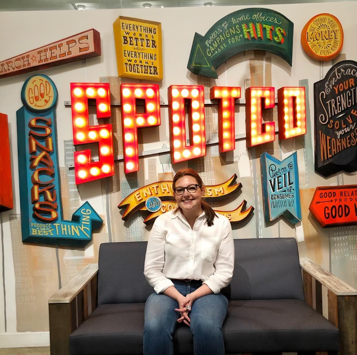
A quick personal anecdote: In my senior year of college, I went on a trip to New York with my university where I researched careers in arts marketing. When I knew I would be going on this trip, I stopped at nothing to get an interview with someone at SpotCo. I took a photo in front of their iconic wall, and remember hating the photo at the time and being too embarrassed to ask that they take another. I am so grateful to the SpotCo team for their time, generosity, and inspiration.
The fact that this book exists at all is a testament to the lasting impact their artwork has had on Broadway (and off, with a second office in London that works with productions on the West End). That said, this love letter of sorts is to highlight posters I think deserve a little more love.
Here are some favorites in alphabetical order.
Annie Get Your Gun (Broadway, 1999)
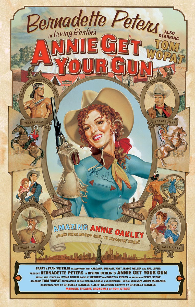
The Bernadette Peters-led production of Irving Berlin’s Annie Get Your Gun in 1999 may have sold itself, but that didn’t stop SpotCo from going above and beyond. Invited to be a part of the creative process, Peters was along for the ride from the preliminary design meetings until its erection on the side of a “huge building in Times Square” (Mark Stutzman, Illustrator).
This stunning piece of illustration, centered around Peters (because...wouldn’t you?) was intended as a cross between “a classic Western tour poster and a Vargas pinup” (Stutzman). Not only is it an incredibly effective poster, but it’s truly a work of art. The days of hand-drawn illustrations with this level of detail are becoming farther and farther away, but make perhaps the biggest impact to me. If you love a show, you may want to hang the poster up in your home or display your playbill prominently on a shelf. But, remember when the artwork was so jaw-droppingly stunning that you would want it featured regardless of your attachment to the piece? They just don’t make them like this anymore.
Bat Boy: The Musical (Off-Broadway, 2001)
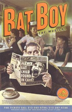
When it came to designing the artwork for this world-premiere musical in 2001, there were a few key elements in consideration – paying homage to its origins as a character in the tabloid The Weekly World News, getting across that Bat Boy isn’t terrifying but just a handsome man (Broadway’s Deven May played the titular character in this production) with pointy ears, and, perhaps most importantly, it that it is NOT a show about baseball.
The poster, in which Bat Boy is hiding in plain sight surrounded by regular, everyday people, was photographed at a small shoot at Jones Diner on Lafayette and Great Jones. The whole shebang featured two paid extras, two volunteer extras (one, the wife of Photographer Richie Fahey in a waitress costume from the back of their closet, the other, the assistant on the shoot), and three props: two mugs, also from Fahey’s home, and a newspaper. The result is a mystical work of art that drew inspiration from iconic Nosferatu-esque vampiric motifs and the classic diner aesthetic.
Bat Boy quickly became a cult favorite, and this is an instance where I feel confident in paying due to SpotCo for their success. After all, in the wrong hands, people may have thought it was a show about baseball!
The Elephant Man (Broadway, 2014)
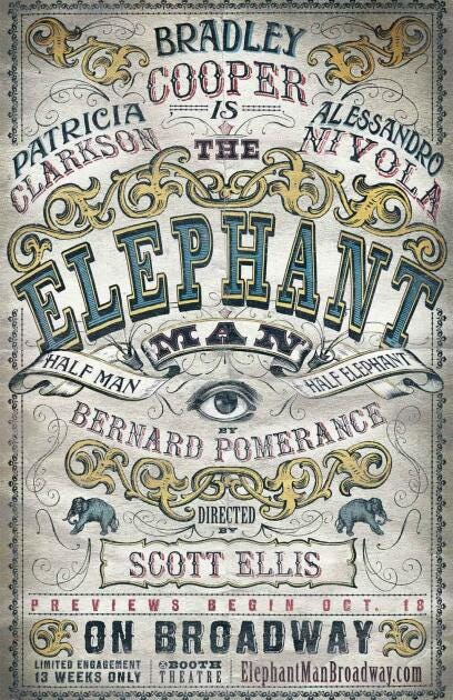
While New Yorkers saw Denzel’s face at every turn during his brief run as Julius Caesar (see below), Bradley Cooper’s face was nowhere to be found during his run in 2014’s The Elephant Man. The design, clearly inspired by Vaudevillian and “freak show” signage around the turn of the 20th century, features bold typography and supporting (though, not revealing) illustrations in lieu of photographs.
What was special about this design project was how it worked in tandem with the immersive nature of the production. Cooper insisted that patrons and passersby be transported to the circus-like atmosphere upon reaching the Booth Theatre. Outside, the entire theatre was wrapped in similar illustrations. Inside, the theatre donned lush, red curtains and the Front-of-House staff were dressed in head-to-toe Victorian garb. While SpotCo helped make this possible, it was Cooper’s ideas that brought this entire world to life.
Julius Caesar (Broadway, 2005)
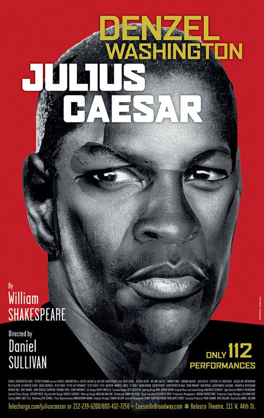
If you couldn’t tell, I’m trying to choose a little something from the various types of poster designs. For 2005’s Julius Caesar, the poster trope is, “We’re selling the person, not the production.” There are a lot of successful designs along these lines, but this is my all-time favorite. Denzel’s off-kilter (the result of the collage of photos used to re-create Washington’s face) black and white portrait that defies proportionate reality is completely striking against the blood-red backdrop. It’s fresh, it’s modern, it’s just what you need for a limited engagement where the star is the selling point.
La Cage aux Folles (Broadway, 2010)
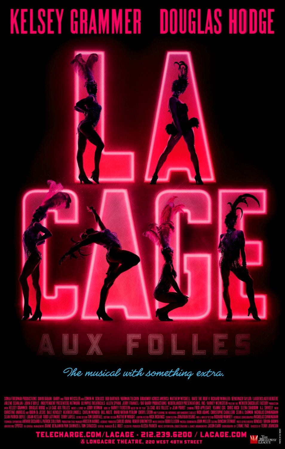
I have seen a lot of great designs for La Cage (SpotCo also did the 2004 revival) from SpotCo and beyond, but the design for the 2010 revival takes the cake. Breathing new, truly vivid, life into the Harvey Fierstein-penned classic, this design says “au revoir” to a bright day in the South of France and instead says “bonjour” to the sensual, secret world of France’s sexiest club.
This design is by no means spectacularly elaborate, but packs a massive punch with the shadowy showgirls back-lit in front of hot pink neon letters. Years before Moulin Rouge! brought the elusive Montmartre Quarter of Paris to Broadway, La Cage reinvented itself as the hottest club in New York City.
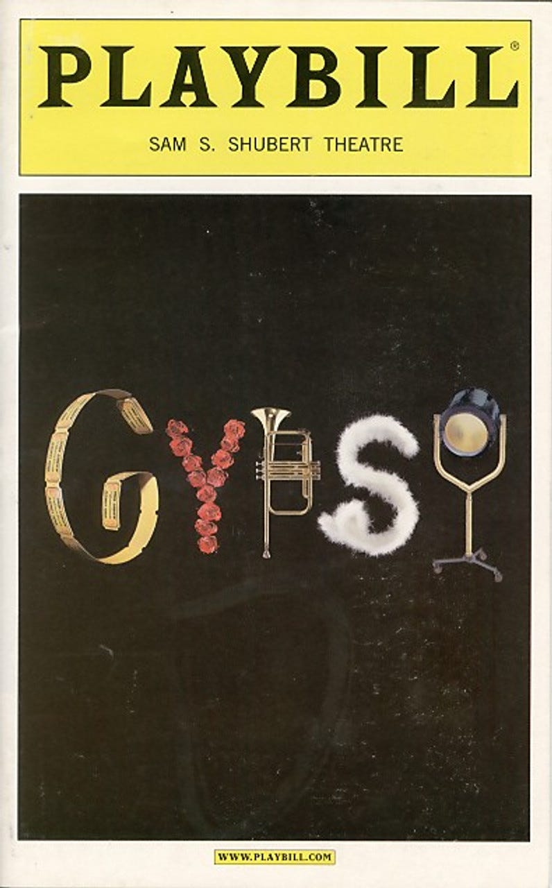
Honorable Mention: Gypsy (Broadway, 2003)
As someone who works in theatre marketing, there’s nothing that grinds my gears quite like being told that there will not be a pre-production photo shoot with actors and that I’ll “just have to make do with the logo.” But...I need actors! Eyes are the window to the soul! How do I sell a show without giving a glimpse into the vision! While these feelings are valid, I have to say that if the Gypsy logo was dropped on my desk I’d be hard-pressed not to shut my mouth. This logo artwork is EVERYTHING! Because it is, once again, the beloved Bernadette Peters, you don’t have to do anything extraordinary to fill the seats. It’s simple, yet perfectly punchy, and is one of my favorite designs of all time.


