


My Favorite Frank Verlizzo Posters
"Fraver" has brought us some of the theatre's most iconic images.

Frank Verlizzo, known by his signature “Fraver,” is an accomplished poster designer for Broadway and beyond. Because I discovered theatre later in life, not even seeing a play until it was mandated by my freshman college acting class (which changed the trajectory of my career), I can’t say that I “grew up” with these images. That said, it was during the formative years of my artistic growth that I grew up with them. Fraver’s posters were plastered on every square inch of my university’s theatre department hallways, offices, and classrooms. One of the few students in that program to study theatre marketing, those posters kept me company and often inspired me.
This list notably leaves out some of his greatest hits such as his designs for The Lion King, Sunday in the Park with George, Sweeney Todd, and so many more, but if I chose every poster I loved, this list would go on forever!
So here are my personal favorites in chronological order.
Beyond Therapy (Off-Broadway, 1982)
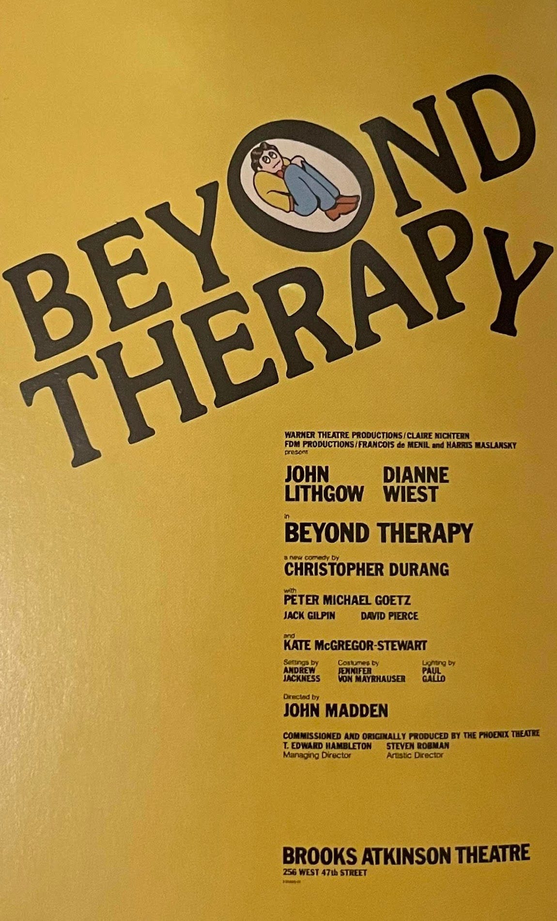
Great posters are supposed to catch your eye, and after four years of walking down the same small university hallway, this poster never stopped catching my eye. I couldn’t go to class without stealing a glance, and I think that speaks volumes to the effectiveness of the design. The name in and of itself is something that leaves you curious about the show’s content, but Fraver’s muted yet vibrant mustard background coupled with the fetal illustration seeking solace from optimism’s inherent color in the “O” is absolutely striking.
Sondheim and Co. (second edition, 1986)
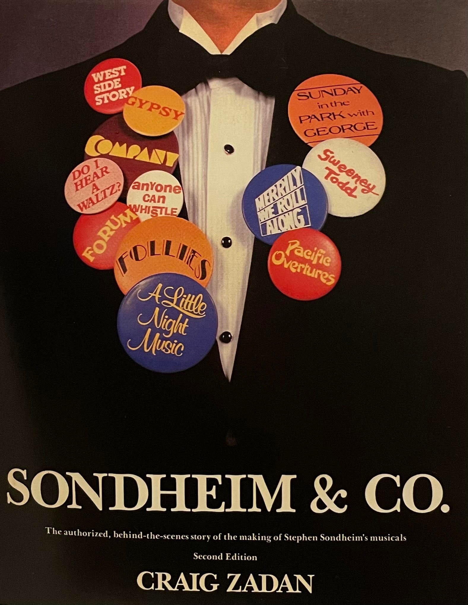
I wanted to highlight a diverse selection of Fraver’s work in this piece to reflect the truly diverse projects he designed. This book, “The authorized, behind-the-scenes story of the making of Stephen Sondheim’s musicals” is a perfect representation of that. Sondheim’s backstory is niche enough of a subject that you don’t really have to sell it to people, per se. The people interested in this topic will find it and read it. That didn’t stop Fraver from creating a captivating graphic for the book’s second edition, though. Enamel pins can be dated back to ancient Egypt and China, from the earliest political campaigns to engaging in civic duties, pins have been a way to show support for organizations, causes, and people. They also have a long history of being related to accolades. Little children don scout patches and pins proudly, and in the military pins are used to distinguish rank and achievement. Few, if any, musical theatre composers are more accomplished, beloved, and celebrated than Steven Sondheim, so to portray these achievements in a collection of vibrant buttons pinned to a tux jacket is not only genius and eye-catching but forces the reader or browser to acknowledge his long list of credits before ever turning to the first page.
Beirut (Off-Broadway, 1987)
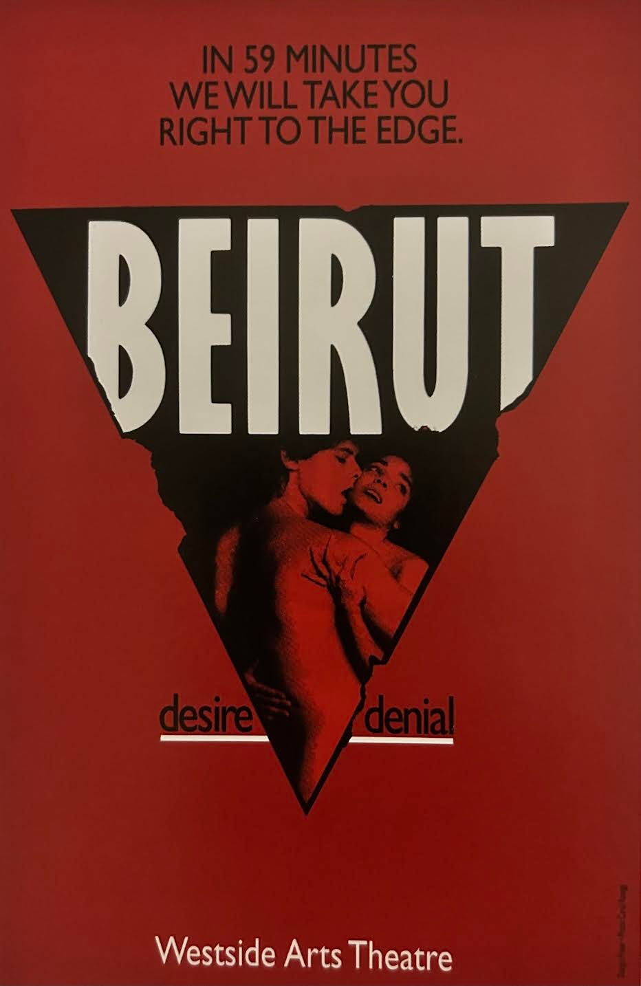
I will be totally honest and say I have never in my life heard of this piece. But when flipping through Fraver By Design, I was totally struck by this poster. First of all, the tagline is great. “IN 59 MINUTES WE WILL TAKE YOU RIGHT TO THE EDGE.” I’m already in. Along with the vibrant red background and the nude embracing couple separating the line of “desire” and “denial” - it all comes together to perfectly establish the experience you can expect to have if you buy a ticket to Westside Arts Theatre for Beirut. I also felt inclined to highlight his Off-Broadway work with this one.
Agatha Christie’s The Mousetrap (London, 1990)
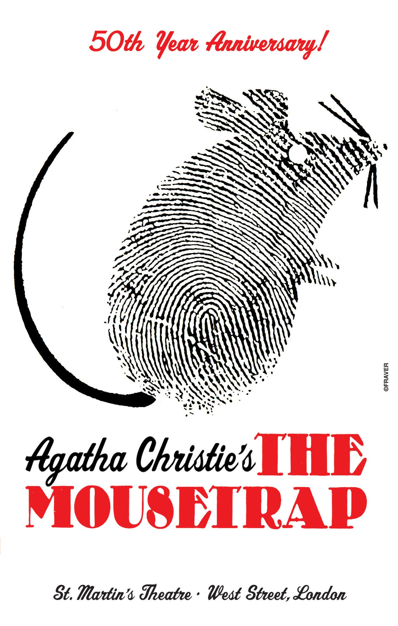
Everyone knows Agatha Christie, and they probably also know, or at least have heard of The Mousetrap. But if you’ve been living under a rock or weren’t forced to read Christie in school, then this adorable little fingerprint mouse tells you everything you need to know about this beloved mystery (Which isn’t much! It should stay a mystery!)
The Pirates of Penzance (Off-Off-Broadway, 2000)
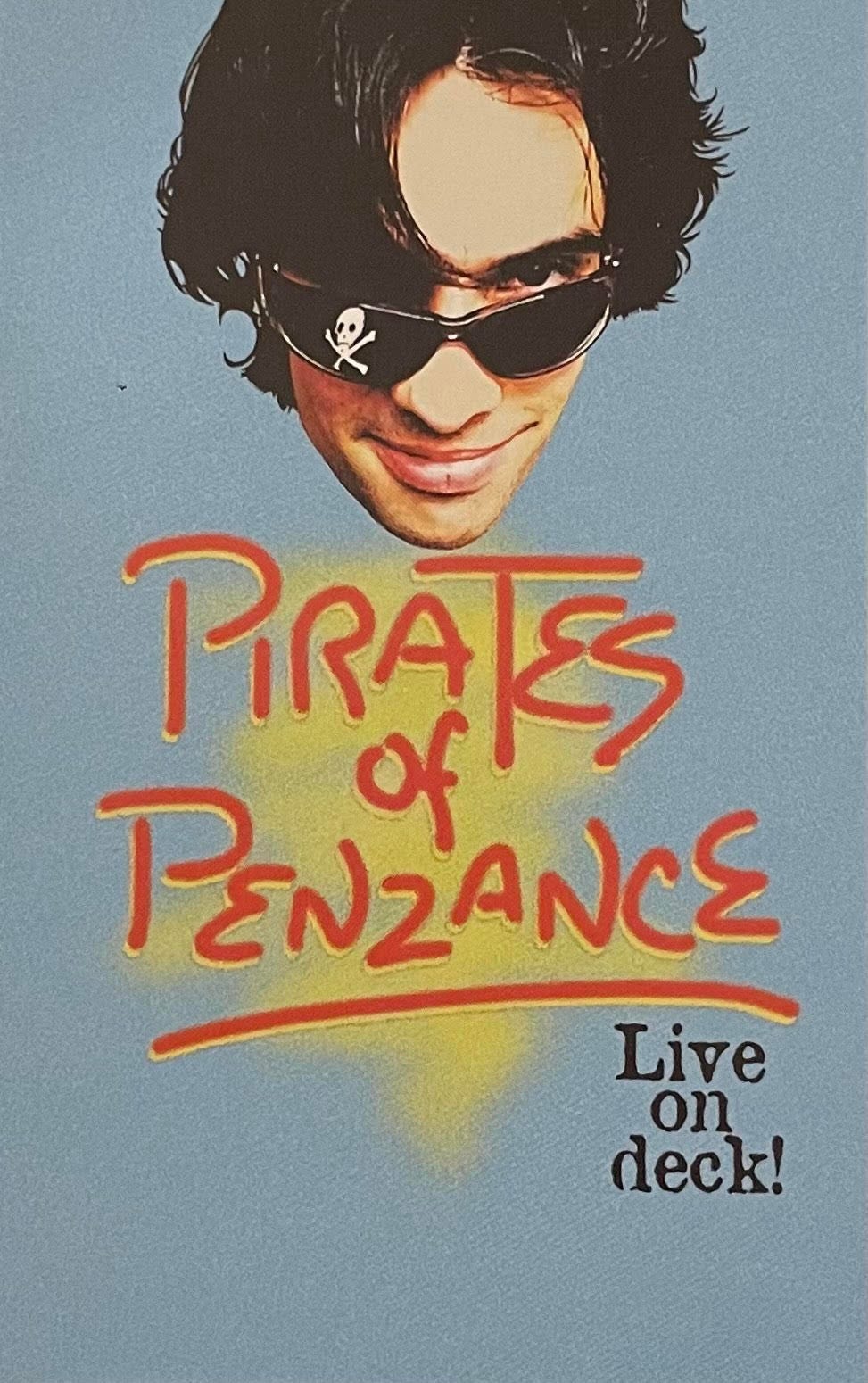
It doesn’t get more Y2K than this. Nothing truly says the new millennium like throwing wrap-around shades on an Entourage-looking guy and calling it a day. I can see how this design would actively turn off an older audience, but frankly, they can kiss my argh. Young, hot people also deserve Pirates of Penzance, (do they?) This is literally camp and that’s all I have to say.
Play Dead (Off-Broadway, 2010)
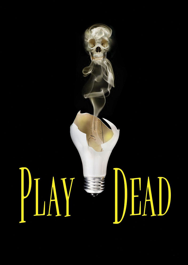
Once again, I love a good tagline, and “ANYTHING CAN HAPPEN IN THE DARK” is a short, inviting, mysterious tag to draw audiences in. This production, even if you know nothing about it, already has one big thing going for it. It’s written and directed by Teller of Penn & Teller - that enough can sell tickets, but Fraver goes the extra mile to create memorable key art that doesn’t distract from any notable name put next to it.
Follies (Kennedy Center and Broadway, 2011)
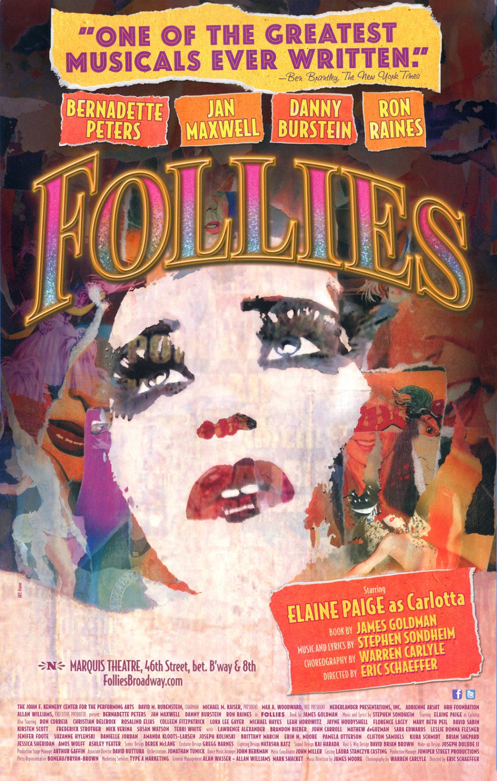
When they say a picture is worth a thousand words, they’re talking about this design. I spend Monday through Friday 9-5 writing and selecting copy for our designers to put on show graphics and between show information, production credits, quotes, and box office details, things can get cluttered quick. Fraver’s design here has a million things going on, but never once does it appear overwhelming visually, and it also manages to evoke stark emotion through its various mirages. It’s nothing short of a masterpiece.
Hamlet and Rosencrantz and Guildenstern Are Dead (The Acting Company, 2013)
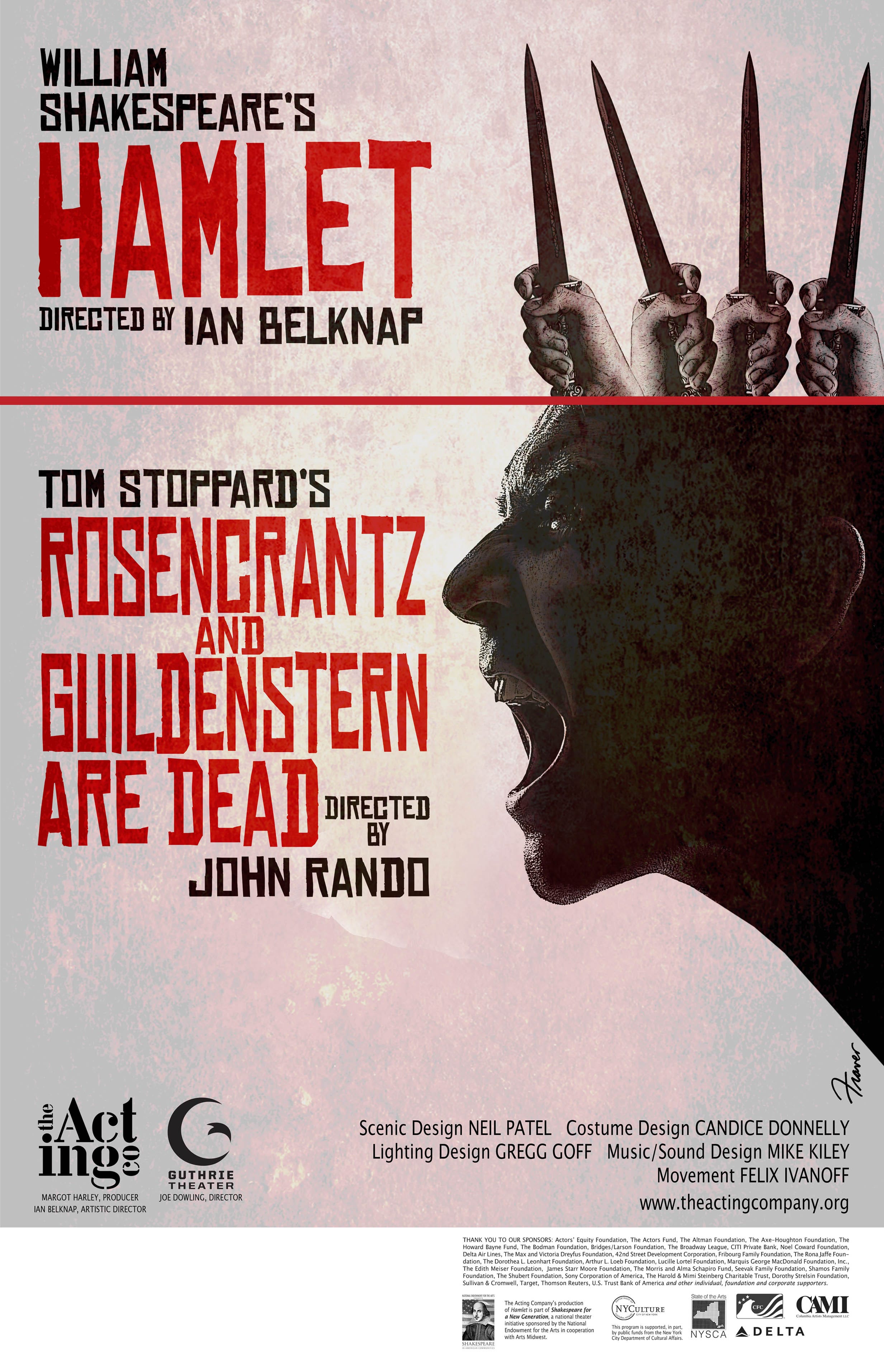
Another Off-Broadway poster, this one is actually two-in-one. I love a repertory production, and it doesn’t get more classic than Hamlet and R&G. I don’t know what to say about this other than it’s just so cool. The way the two images blend together, the way the knives double as a crown, it’s just a great poster. I also love that R&G has more overall space since everyone already knows Hamlet. 10/10.
Long Day’s Journey Into Night (Regional, 2015)

I’m sorry, but Fraver did not have to go this hard on a regional theatre production of a Eugene O’Neill classic that he calls a “masterpiece.” People are going to go anyway! People flock to O’Neill! He could have cashed a check and written “Eugene O’Neill” in big block letters and yet he created one of the most beautiful illustrative graphics I’ve ever seen.
Out of the Mouths of Babes (Off-Broadway, 2016)
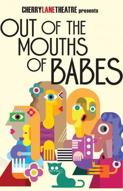
This cubist style is so fun and fresh. This poster looks like it could simply hang in a Cool Girl’s apartment, one who isn't even a theatre lover. A Picasso painting is a story focus, which obviously makes this a great, logical tie-in, but it’s also just a generally eye-catching poster.
 | A guest post by
|