On my most recent visit to the Big Apple, I stopped by Poster House - the first museum in the U.S. solely dedicated to posters! This new (it opened in 2019) and small (but mighty!), free museum is an excellent way to kill time in Chelsea, so if you’re in the area and love to nerd out over posters like I do, I really can’t recommend it enough.
The museum has multiple exhibits that rotate in and out, meaning nothing in their collection is on permanent display. While I find just about everything about posters interesting and would have been happy with just about anything, I got particularly lucky on this trip and got to see their exhibit The Anatomy of a Movie Poster: The Work of Dawn Baillie, which is open through September 8.
Dawn Baillie is the mind behind some of the most iconic posters in recent history. From Dirty Dancing to National Lampoon’s Christmas Vacation to Isle of Dogs, her work as a designer and art director, which spans nearly four decades, is nothing short of prolific. Poster House's examination of her work through the years is a testament to her clear, impressive vision.
Here are some of my favorites featured in the exhibit:
Little Miss Sunshine (2006)
I have seen Little Miss Sunshine dozens of times. I can recite quotes and I can play moments back in my head, but when I hear someone discussing this film, this poster is the first thing that comes to my mind. And that’s because that’s the kind of iconography Dawn Baillie created— truly unforgettable pieces of art that served as not only a piece to spark interest before a film’s release, but ones that act as a familiar reminder as to why you loved it so much once you did see it.
The bold yellow came from Fox Searchlight’s Stephanie Allen, who wanted to “own yellow” for the season. Little did she know, this sunshine yellow would become entirely synonymous with the hit indie film all these years later.
“…this film’s marketing campaign owned yellow in a way that will never be forgotten.” — Molly Albright, Head of Creative Marketing, Movies at Amazon Studios
This artwork could have gone many different ways, but the one direction it could never have gone was by using just one or a few actors. Little Miss Sunshine is, in my opinion, one of the best ensemble films of the past few decades. This moment from the film being the key art perfectly lays that aspect out for potential audience members, while simultaneously showcasing the humor and dysfunction to come when seeing it. For all of these reasons, it’s not only one of my favorite displayed in this exhibit, but of all time.
The Royal Tenenbaums (2001)
Wes Anderson is a master of aesthetic, and it’s something we discuss frequently on The Wes Anderson-a-thon. I also know, through exhaustive research for that podcast, that Wes is extremely particular. Sometimes, when listening to his Criterion commentaries, especially on his early films, I’m shocked that he’s not billed (in addition to writer/director) as the set decorator, costume designer, camera operator, and stunt double. He truly has his paws on everything.
So how does that translate to collaborating with Baillie on posters?*
The Royal Tenenbaums was their first collaboration and Wes asked to be directly involved from the jump (go figure). Conceptually, it was Baillie’s idea to have the central image be a book with elements of the film’s story poking out of the pages. The items around the book, however, were very much Wes, which I think comes across if you’ve seen any of his films. In the Wes Anderson way of capturing things practically, this design is, in its entirety, a still-life photo.
The end result is perfectly Andersonian, so it’s no wonder they went on to be continued collaborators.
*Baillie and Anderson have worked on several posters together. Also featured in the exhibit are The Grand Budapest Hotel and Isle of Dogs.
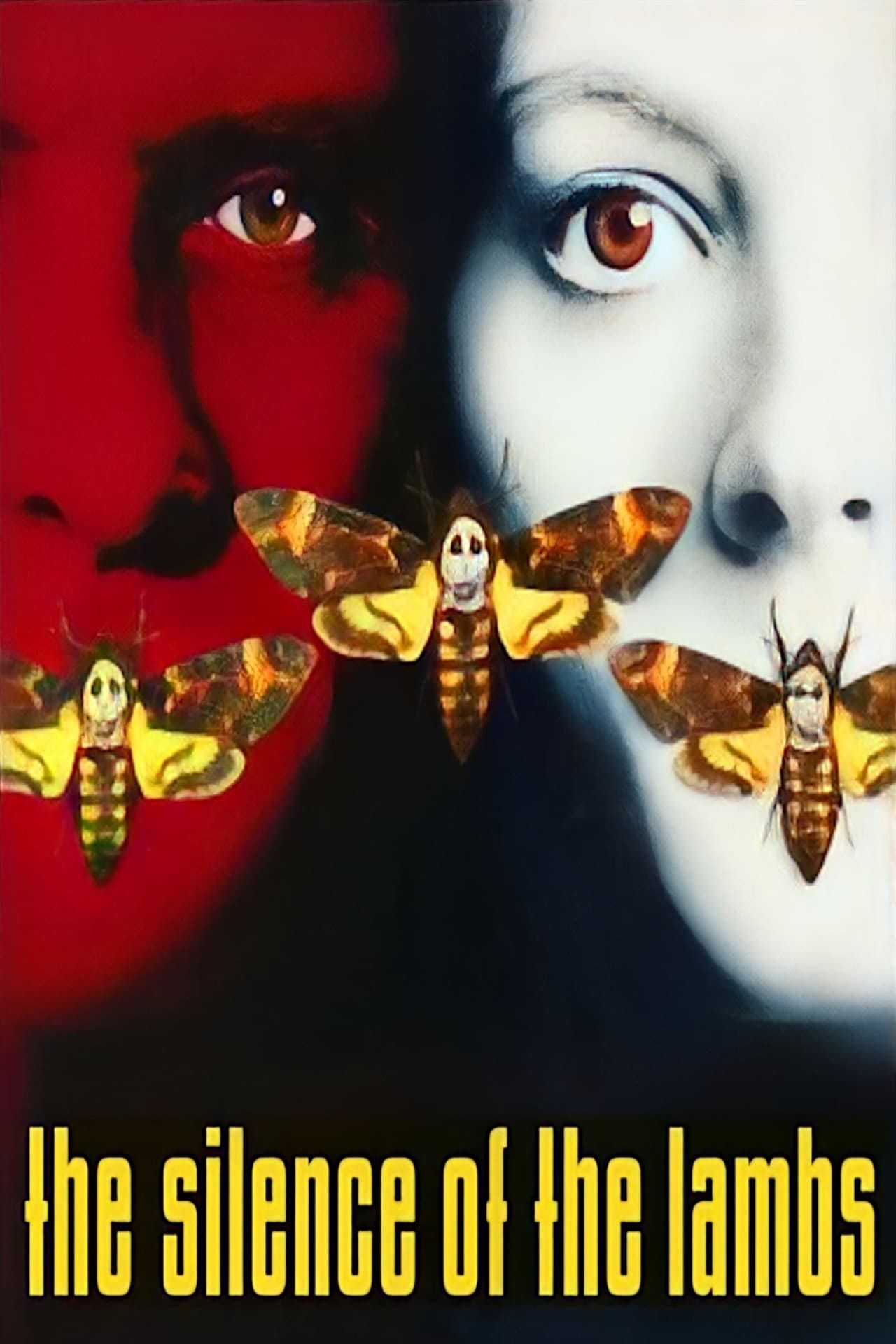
The Silence of the Lambs (1991)
We have all seen the image of Jodie Foster, a chilling white with red eyes, with the iconic moth covering her mouth. Lesser known is that this was just one of three primary posters for Silence of the Lambs.
In talking about this notable work, Baillie said to the New York Times in anticipation of this exhibit, “I think the poster works in showing vulnerability, strangeness, and eeriness.”
As is standard for a leading actor’s contract, it was required for Anthony Hopkins to have equal prominence in the film’s promotional materials. So later on, in addition to the poster featuring just Jodie, a poster was created of just him in red, then the two of them as pictured above. While movie theatres received all three designs for display, it was up to their discretion which one to choose, and almost all went with the image of Jodie, which is partially why that specific iconography continues to have such strong ties to the movie today.
When it comes to the famous death’s head moths, which have a natural skull-like design on their backs, Baillie called up a former professor who worked at the Natural History Museum and rented the specimens for photographing. “But now,” Baillie says, “I see you can buy death’s head moths on eBay.”
The Silence of the Lambs was a cultural reset. It served as an entrance to a new era of chilling movies and it only makes sense that it would have an iconic poster to accompany it.
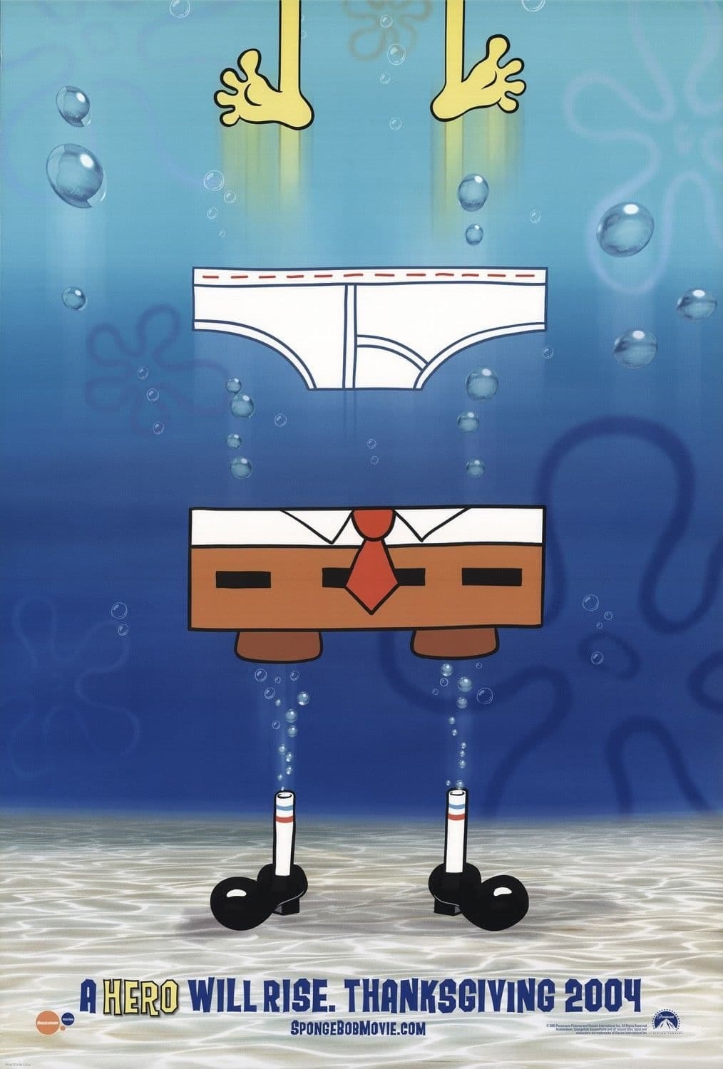
The SpongeBob SquarePants Movie (2004)
We have been covering SpongeBob SquarePants on Y2Kidz this year, and I couldn’t believe it when I saw the movie poster featured in the exhibit. I have always found this design to be so fun and clever, and never would have guessed it came from the same mind as Sleepless in Seattle or Zoolander, (okay, maybe I can see that one a bit…)
For Baillie, this poster was surprisingly very personal. Her children, young at the time, were massive fans of SpongeBob and she was completely intent on landing the project.
What is so daring about this design is the fact that, other than his feet, the world-famous sponge is nowhere to be seen. Baillie felt like she knew what kids found funny about the show, and made the tighty-whities a priority in the final design. The design of SpongeBob SquarePants (the T.V. show, not just the character) is so visually iconic in its own right, with the floral clouds and bold shapes and colors, that Baillie had a lot of room to play outside of the characters. What we end up getting is a poster for kids, by kids’ interests.
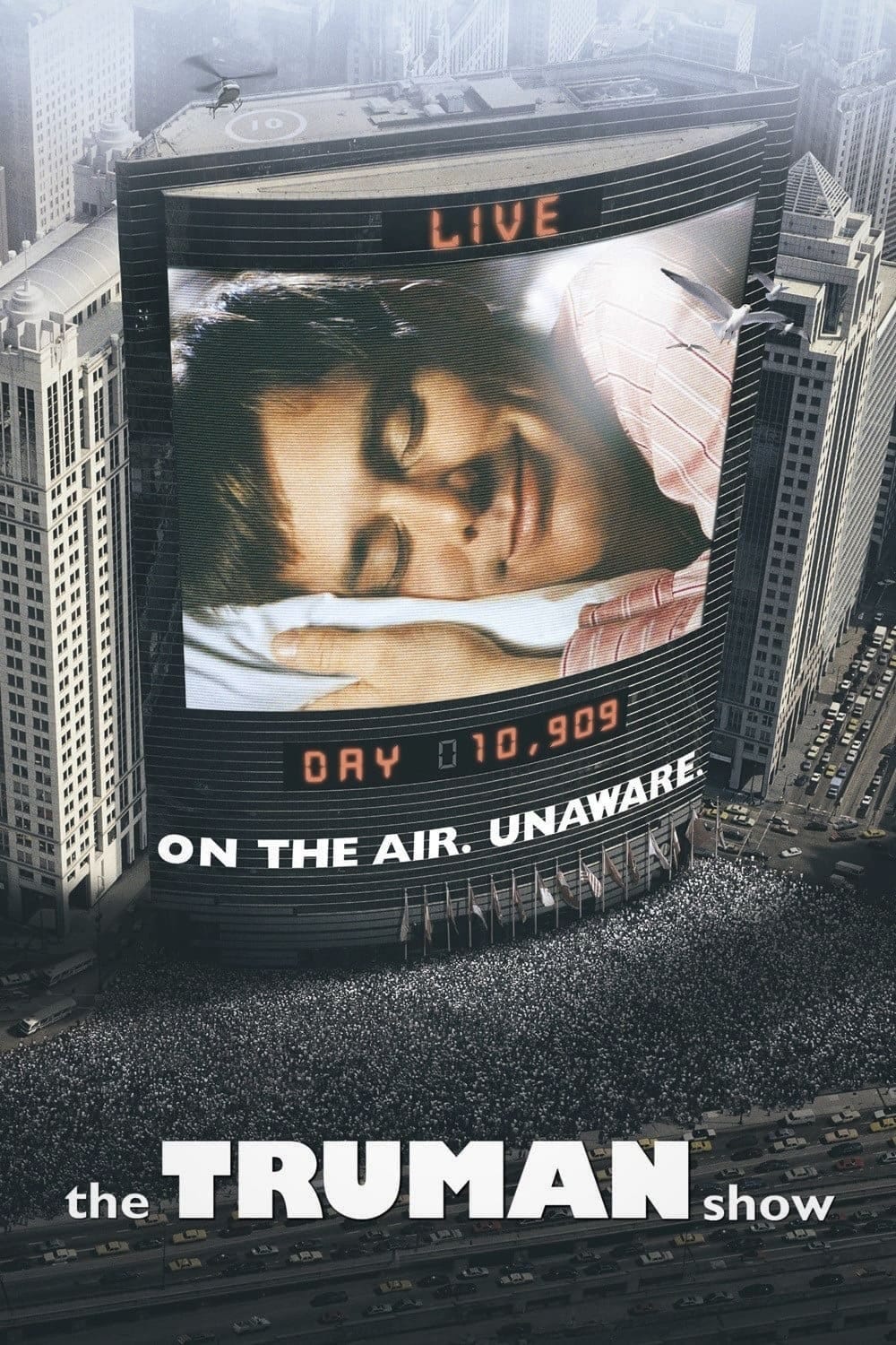
The Truman Show (1998)
While on the surface this poster appears to be rather simple conceptually (simple is definitely not a bad thing here— it’s extremely effective!), it was a complicated technical feat in the new and rapidly expanding Photoshop tool.
Baillie’s direction from Paramount for this design was to convey the essence of the film without revealing too much of the story. With this, she got the idea to pair Truman, doing something extremely mundane like sleeping, with the word LIVE. To get the point across about just how many people—millions, to be exact— were watching Truman, she layered hundreds of stock images of crowds for the Chicago scene pictured.
“At that point, I was working as a creative director, and Steven Stewart was my designer on that, helping to assemble hundreds of photos into Photoshop to try to create the scene. That would give you an idea of what was happening in the movie, which was actually bigger than what the-- The script is amazing and it's in a really beautiful film, but what I was trying to convey there was millions of people watching this character, Truman sleep. I thought that was the way to really convey this beautiful story.” —Dawn Baillie for WNYC


